Colour
Palette
The Klarstein brand uses colours that represent the vibrancy of our customer’s modes.
Colour overview
Our core palette is bold and vibrant – featuring multiple colours. In communications we should only use our core palette, however on our site we can use tints of 60% and 20%.


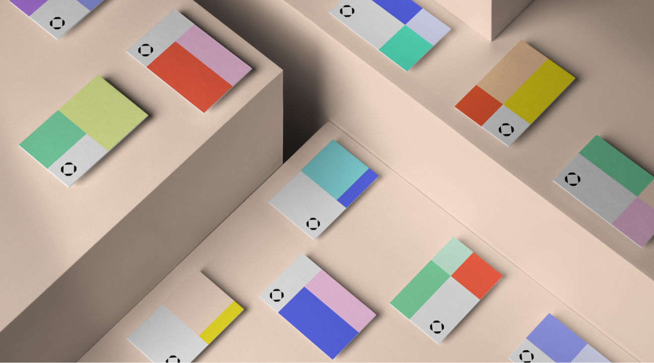
Colour combinations
Create colour combinations by pairing two of our core colours. Remembering to make sure that they don’t clash and work in harmony. Use these pairings to determine and categorise Home Modes.


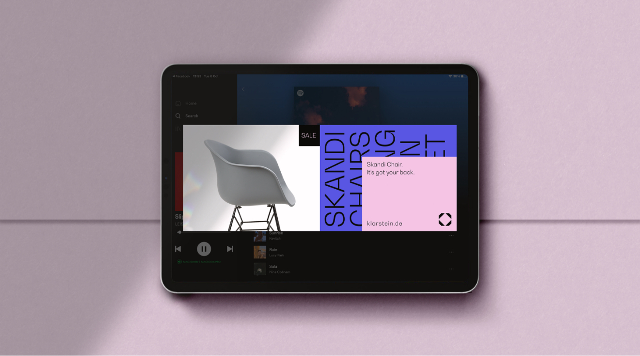
MODE SPECIFIC examples
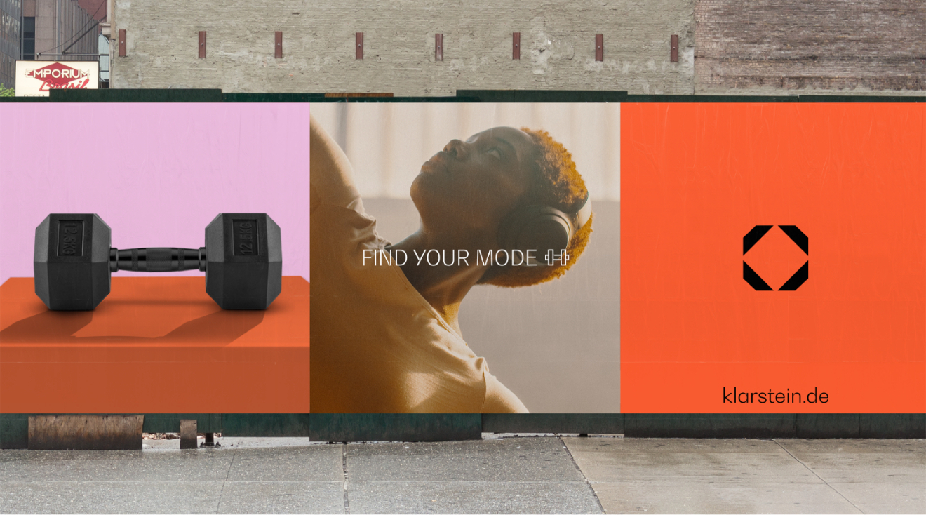
Here are some examples of how we can use colour to express modes.
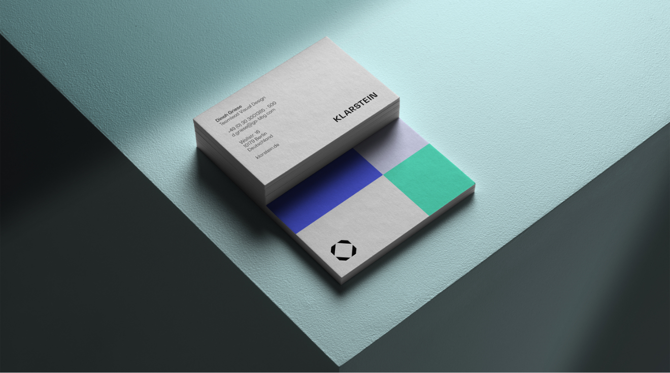
KLARSTEIN LEAD examples
For internal communications such as business cards and presentation slides we can be more expressive with our use of colour. Meaning you can use any of our colour combinations, along with a tint of either 60% or 20%.