Iconography
Unique icons that represent each home mode as well as website functions. These symbols can be used with type or independently.
Iconography overview
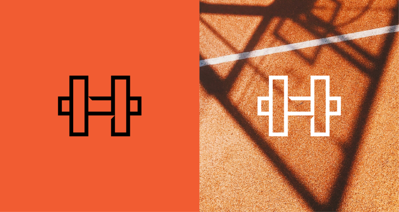
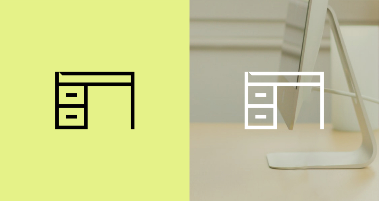
Here is our set of icons. We use these icons to define modes and illustrate our products. Inspired by our symbol, each icon has been designed with a bespoke cut.


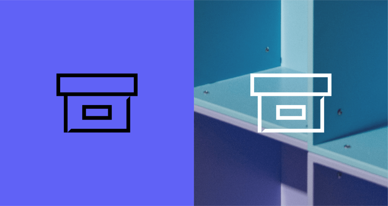
The grid
Our icons were constructed on a 22x22 to optically match the width of our typeface, BW Gradual. Each icon has a bespoke 45º cut inspired by our symbol.


Icons in animation
We also have a set of functional icons. These can animate on our website – but the motion must feel playful and natural. Use these animated icons to add a layer of interactivity for customers.
Icons with type
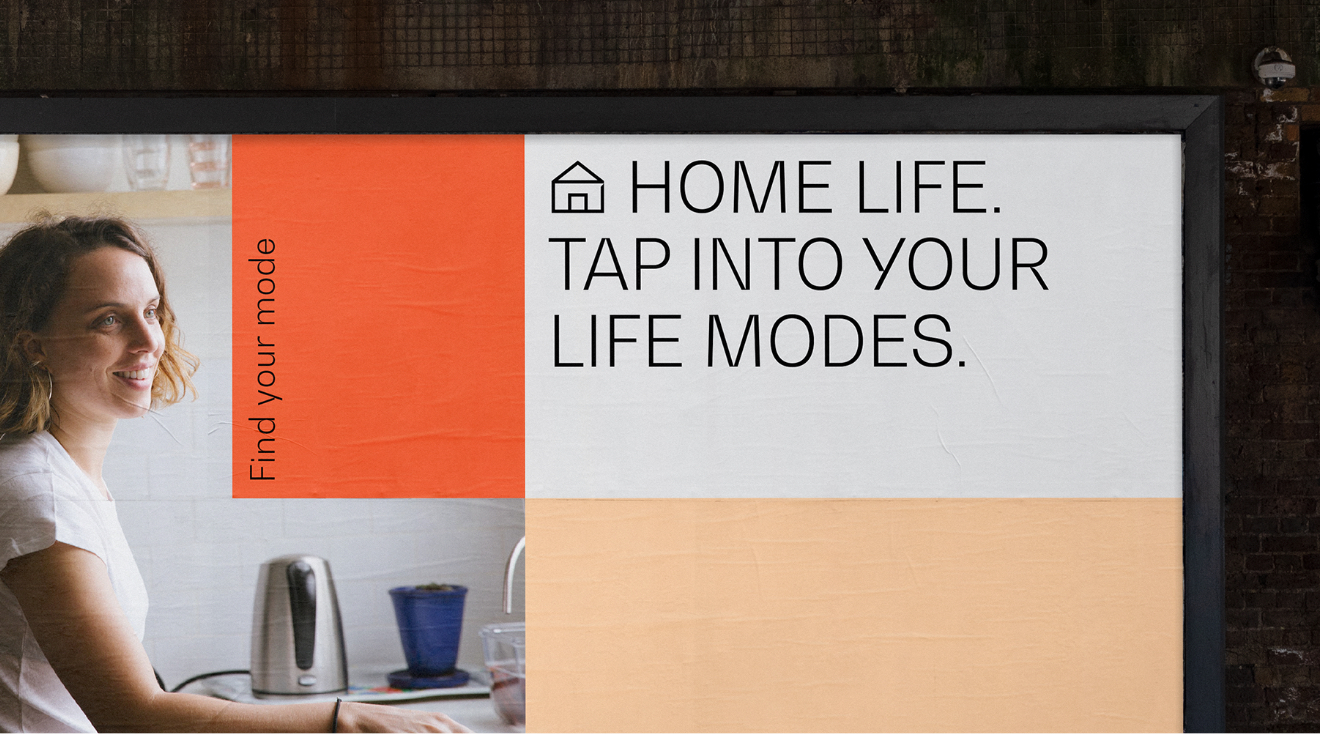
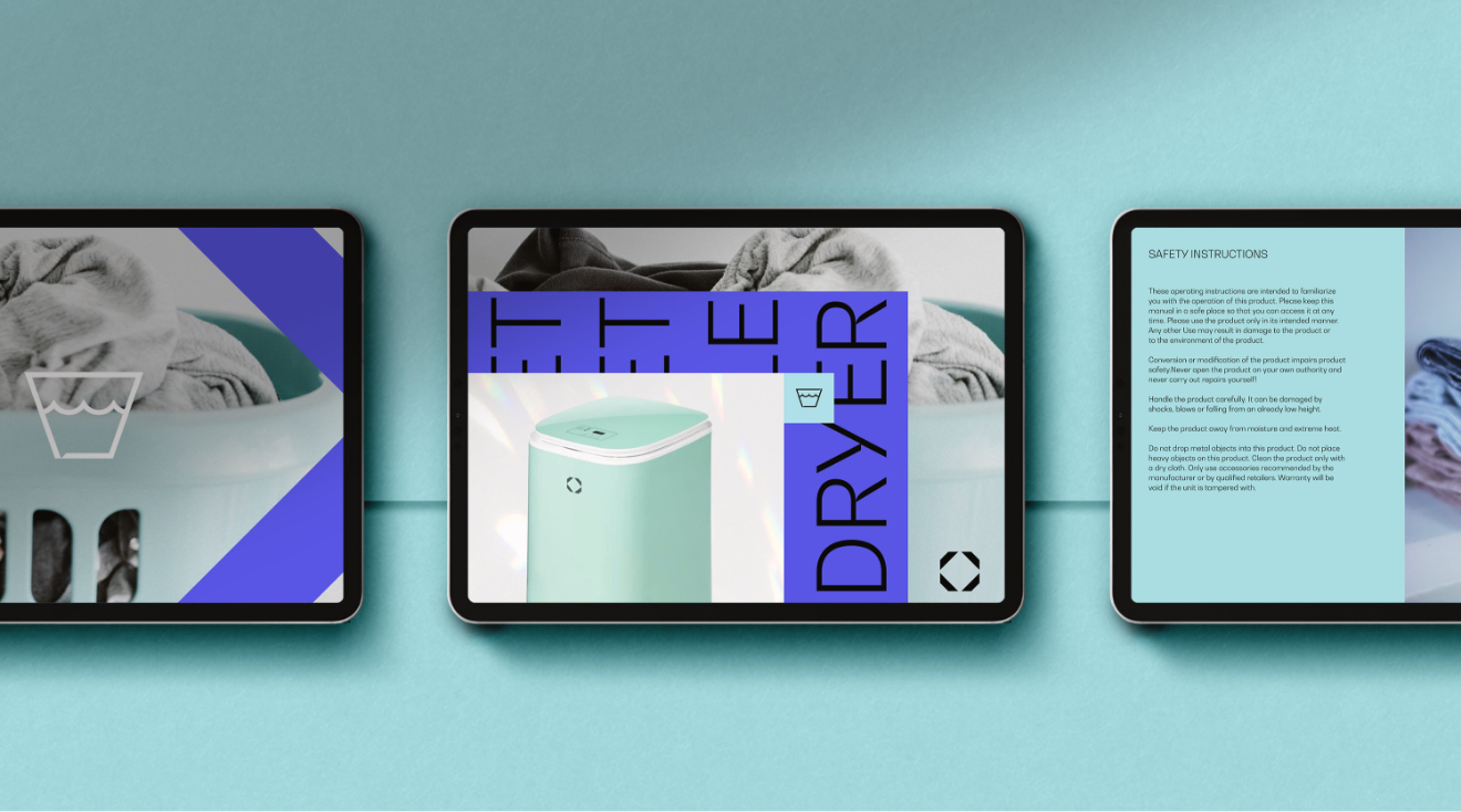
We can use our set of icons alongside our typography in a playful and functional manner. Use the appropriate icon with the copy (for example a coffee mug against copy about coffee) and not to exceed more than two symbols per an application.
Examples
Here are some examples of how our iconography comes to life across different applications.